Pages

Sunday, April 23, 2023

A Rainbow of Random

Last week I was talking to Steve and Nate (my father and brother), and they mentioned using white noise generators to help with sleeping. That made me think of a meeting I was in earlier in the week where someone mentioned that LIGO and LISA typically have red noise contaminating the measurements. That made me wonder: What does red noise (or other colors of noise) sound like?

First off, we need to talk about what it means for noise to have a particular color. In the context of light, color tells use the frequency of light: red light has lower frequency than blue light, and white light is a mixture of all frequencies. We can apply the same principle to frequencies of sound: more low frequencies is redder, and more high frequencies is bluer. We figure out the "color" of a dataset by taking its Fourier transform, and looking at where the peak frequency lies. White noise has an equal amount of power in all frequencies.

That's the theory, but how do we go about generating different noise colors? White noise is easy: Given some sampling rate, we generate uniformly distributed random numbers. Because these numbers are uncorrelated, they don't favor any frequency, and give a flat spectrum. We can "redden" that noise by giving each sample some dependance on the previous. This page suggests mixing each sample with part of the previous:

where x is the series of samples, w a series of white samples, and r a tuning parameter between 0 and 1, with 0 giving white noise, and 1 giving constant values. For blue noise, we want to do the opposite: sequential values should be as different as possible. To do that we can follow the method here: For each blue point we want to generate, we get several white points and pick the one furthest from a previous sample.

We still haven't gotten to what these different noises sound like though. For that, we can use Javascript's AudioContext, and pipe these sequences of values through your speakers. Below, you'll find a slider to control the color of the noise – For red noise, it represents the r from above, and for blue noise it represents how many samples ago to avoid. That technique isn't quite right, so for values above zero (which is the white noise point) there isn't a continuous transition. In the window above the slider, you can see the Fourier transform of the sound, with the frequency going left to right. Maybe not the most soothing sounds, but I hope it can give you some insight into the sort of problems scientists have to deal with.

Sunday, April 16, 2023

Da Breeze of Debris

I recently saw a blog post suggesting publicly available datasets good for testing analysis techniques. Paging through them, I found the US Government's data server included NASA resources, and a connection to my own research occurred to me: One of my colleagues at the University of Florida has been working on simulating the effect of micrometeorite impacts on the LISA spacecraft. At a recent meeting, he was discussing the direction the meteorites might hit the spacecraft – They're generally falling inward toward the Sun, while the satellites (and the Earth) are orbiting around the Sun:

According to this model, very few meteorites should hit from the side facing the Sun. Less obvious though is the other 3 sides: Do more hit the side opposite the Sun, or is there a greater effect from the orbit taking us into the meteorite's path?

NASA's datasets include a record of meteorite landings on Earth, spanning the last 2 centuries, but unfortunately only provides the year, which means we can't find the Earth's position in the orbit. I almost gave up, but then I found a list of Fireball and Bollide Reports, which gives the precise date. Unlike the previous table, these are objects that completely burned in the atmosphere. We can look at the locations where these events were reported, using one of the map projections I discussed a while ago:

These appear fairly evenly distributed, but this plot doesn't consider the location of the Sun. Using the Astropy package, we can find the location of the Sun for a given date, then find the angle from the Sun to Earth, to the direction of the report:

This would seem to suggest that the most common angle is 90°, which corresponds to the orbit taking us into the meteorite. However, there are some significant caveats to this conclusion: It may be that there's a bias in this data, since it's easier to see a streak across the sky, while a meteor coming head-on would just appear as a point. Then there are the limitations of my analysis: The table only give the date of the events, not a time, so I may be introducing bias by choosing midnight. I'll be curious to see what results my colleague turns up, and maybe I'll find more datasets in the list to play with in the future.

Sunday, April 9, 2023

Anneal Before Zod

Almost a year ago, I promised to talk about annealing, and now I'm finally getting around to it! I mentioned that you might be more familiar with it than you think, and that's because it's behind something often referred to as the Brazil Nut Effect. I'm not a big fan of mixed nuts, but I do like granola:

Granola will typically have a variety of sizes of cluster, and shaking the bag causes the larger clusters to rise to the top. This happens because the smaller clusters can pack together more densely, and by having those lower in the bag, the system is in a lower energy state. What's interesting is how we got to that lower energy – By shaking the bag, we're adding energy. This seems counterintuitive, but it's the process behind annealing.

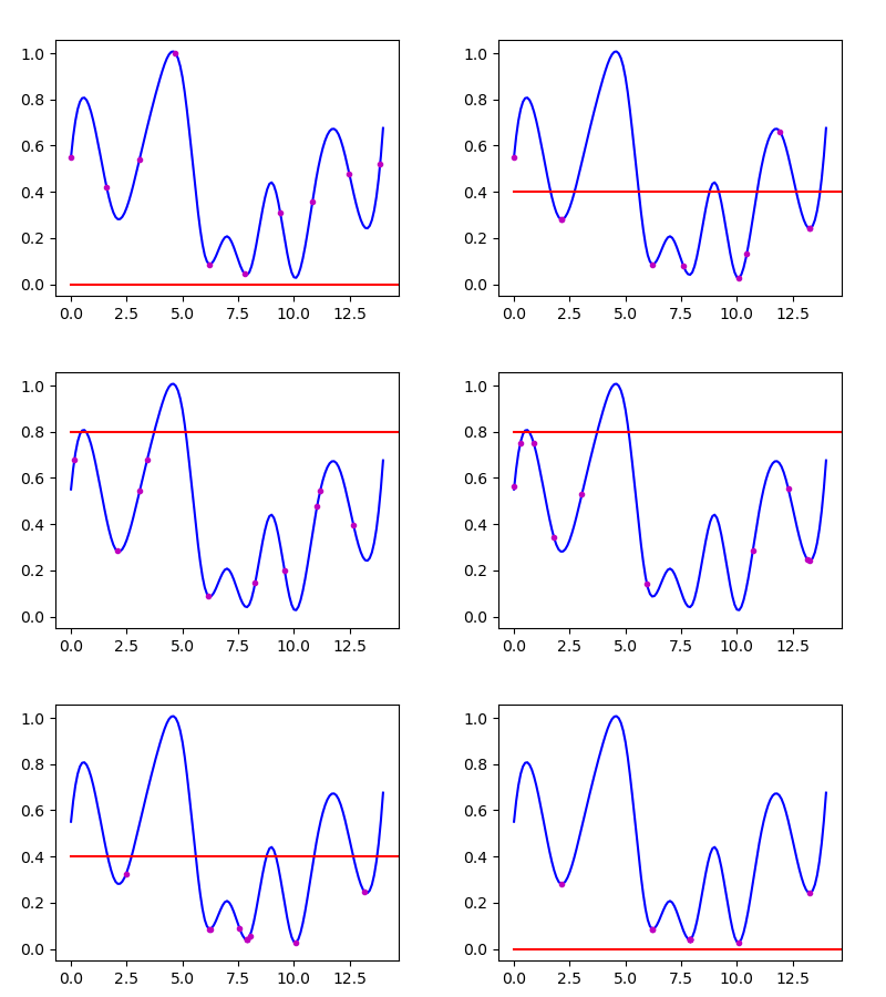
If we imagine a potential energy plot like the one I showed a few weeks ago, we can think about how to find the lowest energy state:

We could think about rolling a ball over these hills – We'd like it to settle in the lowest troughs, around 7.5 or 10, but it could get stuck in the ones at 2 and 13, analogous to the large clusters being stuck at the bottom of the bag. To solve this, we can give the ball a temperature, which represents an average velocity. By increasing the temperature, we can get the ball to explore the full range of states, then cool it down gradually to allow it to settle in the lowest-energy position. In the graph below, I've done this with several balls, initially spaced across the full range. The red line shows the temperature, which rises and falls.

A few balls still get trapped in the higher energy states, but the majority find those central troughs. Every time I shake a container to get things to settle, I think about this effect – Maybe now you will too!