Pages

Saturday, December 7, 2024

Re: Re: Re: Charge

A topic of much debate when using battery-powered devices, like phones, laptops, or electric toothbrushes is, how often should they be charged? The main schools of thought are, charge whenever you have power available, or charge only when the battery dies or is low. I tend to subscribe to the second theory, on the principle that batteries are typically rated for a fixed number of charge/discharge cycles. My laptop has some built-in protection that limits how often it charges:

Batteries work through a chemical reaction between two reactants suspended in an electrolyte. Electrons pass between the reactants, creating a current and dissolving some of the reactants into the electrolyte. This is a bit oversimplified, but I am, after all a physicist, so that's how I like things. I wanted to see whether this model could back up my charging habits.

The setup I settled on was several electrodes, each surrounded by a block of reactant, and the whole thing surrounded by electrolyte. Then I put the system through several charge/discharge cycles. During each discharge step, we find all the reactant that's in contact with electrolyte, and dissolve it into electrolyte with some probability. During charging steps, we do the reverse: Find electrolyte in contact with either reactant or electrode, and precipitate reactant with some probability. We keep track of how many changes happen each cycle, which corresponds to the amount of current produced, and we vary the number of repeated discharge steps before switching to charging, and vice versa.

There's a lot of parameters to tune here (probability of state change, number of electrodes, amount of electrolyte), so I haven't come close to exploring the full space, but I'm still pretty happy with the results. This case used 200 steps for each discharge/charge cycle:

You can see we use up most of the reactant (yellow) on each cycle. If we switch to only 80 steps, things look a little more ragged:

We can measure how much reactant is around at the start of each discharge, and plot how it changes as we go through cycles for several different cycle lengths:

For all but the extreme 2-step case, these quickly reach an equilibrium max charge (plotted as a fraction of the initial). I was curious what was going on with 2-steps, so I plotted what it looks like at the end of the simulation:

Because of the way I set up the cycling between dissolution and precipitation, the system tends toward holding only as many as it adds on during charging – That's the source of the pattern in the max charge plot above, and not (as I initially thought) my belief about battery health. As result, I think I have to consider this sim inconclusive as far as charging habits. Maybe I'll do a followup later (which will of course be called "Re: Re: Re: Re: Charge")!

Saturday, October 26, 2024

A Mass of Incandescent Gas

[Title from They Might Be Giants.]

This week, I got a question from my father Steve: We're able to identify the source of nuclear materials used in reactors and weapons from their isotope ratios. Could we do the same thing to figure out which star material that hits Earth came from?

First, let's talk about isotopes: Atoms are made up of a nucleus or protons and neutrons, surrounded by a cloud of electrons. The number of protons tells you what element the atom is – one for hydrogen, two for helium, and on down the periodic table. The number of electrons tells you the charge of the atom – neutral if it's equal to the number of protons, negative or positive for more or fewer electrons. Finally, the number of neutrons tells you the isotope – These are variations on the same element. For example, most carbon on Earth is called carbon-12, which has 6 protons and 6 neutrons for a total atomic mass of 12. However, some is carbon-14, which has 6 protons (since it's still carbon), but 8 neutrons. This configuration is unstable, and gradually decays to carbon-12. The mixture of carbon-14 and carbon-12 leads to radiocarbon dating, which is used in archeology to measure the age of excavations.

Natural uranium is almost all U-238, with small amounts of U-235 and a few other isotopes. Putting it in a nuclear reactor though will change those ratios. As the U-238 decays, it loses neutrons, raising the amount of U-235 present. The amount of U-235 in a sample can be further increased through enrichment, which uses various methods (often advanced centrifuges, which come up in nuclear policy) to separate the lighter U-235 from the heavier U-238. There can also be other isotopes of other elements mixed in depending on the exact process a reactor was using.

Now to stellar compositions: Stars are mostly made up of hydrogen, but the star's mass causes the hydrogen to fuse into helium, releasing energy that helps keep the star from collapsing. Helium can fuse too, and that can continue a few steps down the periodic table, but it's limited, typically petering out near iron:

Wikipedia (Click to enlarge)

The elements in yellow may be present in an active star, and will be spread around the universe when the star eventually explodes. We can find which are in a given star by looking at their absorption spectra:

Wikipedia

The star emits light in a black-body spectrum due to its heat, but the elements it contains will absorb some of that light, leading to dark bands on the spectrum. The frequencies (colors) of those bands correspond to different elements that let us determine the composition of the star.

Now to Steve's suggestion: When massive particles hit the Earth, could we use their makeup to associate them with a particular star? To my understanding, the answer is no, the particles that hit us are typically single protons or neutrons, not entire atoms, and certainly not the collection of atoms that would be needed to find a concentration of certain isotopes. There's another problem too: Uranium and other elements typically associated with isotopic signatures aren't present in active stars – If you look at the table above, you see those need neutron star collisions to form.

So it seems this idea won't work for distant stars, but if we screw things up badly enough on Earth, future scientists will be able to figure out where things went wrong, and curse that we ever trusted Mr. Clevver.

Sunday, October 13, 2024

Zooming On My Cycle

I started my job with the University of Florida in April 2020, right as the COVID work-from-home policies were starting up. As a result, all my meetings are conducted over Zoom. Now and then I get a little bored with the subject at hand (but only very rarely!) and I start thinking about the layout of the meeting participants on my screen:

I try to move my mouse from each window to an adjacent one, visiting each once and returning to the start. This type of problem is the subject of graph theory, which assesses the attributes of nodes (the windows in this case), which are connected by edges (whether two windows are adjacent). The quality we're looking for is called a Hamiltonian cycle. My various meetings have different numbers of participants, and I've been fascinated by whether a given arrangement contains one or more of these cycles.

It turns out this problem is in a category called NP-complete, which is broadly defined as problems that are hard to find solutions for, but easy to check if a given answer works. In this case, given a path through the windows, it's easy to check we visit each once and end at the start, but the only way to find those is to check every possible path. As long as the number of nodes is small, this isn't too taxing, but the complexity scales quickly as we add more people.

Luckily, Zoom only puts 25 people on the screen at a time, and will break the group into pages if there are more. That means I can make a script to test every case! I used the package NetworkX to handle the connections between nodes, which let me generate paths to check. The animation below pages through different numbers of meeting participants, and gives the number of unique cycles at the top.

I find it really interesting how the number of cycles relates to the number of nodes: Even ignoring the drops to zero, the numbers aren't strictly increasing. I'm also surprised by the high numbers of cycles for the bigger groups – I usually only find 1 or 2 before I manage to refocus on the meeting!

Sunday, October 6, 2024

Touched By His Noodly Appendage

[Click here if you've yet to welcome the Flying Spaghetti Monster into your heart and stomach!]

Near out house, there a several car dealerships, which have the requisite flailing noodle men out front:


via GIPHY

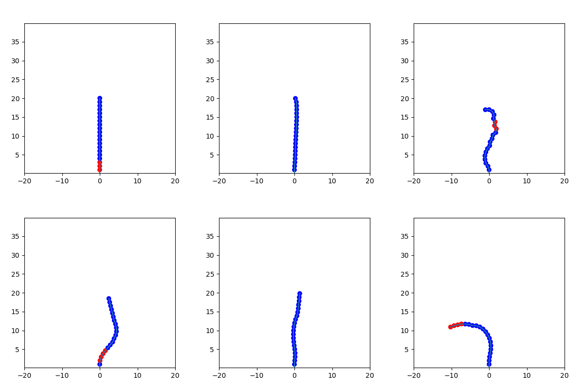
I was curious whether I could make a simple model of this system that still showed the interesting dynamics. The way I imagined it was a series of joints stacked on top of each other with fixed length, but able to bend left or right. Gravity will bend each joint according to the distribution of mass above it, and the puffs of air will straighten each joint as it passes through.

Since I'm using only 20 nodes, at first I tried to make the pressure changes move between them smoothly, but I couldn't find a good way to do that without adding a bunch more complexity to the simulation, so instead I just had the pressure move to the next node on each step. The air comes in periodic bursts, which I modeled as a square wave, which turns on and off at some frequency. When I tried this model, I got a bit too much flailing, and my noodle person was spinning crazily around the anchor point, so I realized I needed drag.

There are two typical models for drag, both proportional to the object's velocity, but one linear and the other quadratic. I tried the linear case initially, but that wasn't strong enough, so I switched to the quadratic. I makes sense that we would be in the high-drag case, since this is flimsy plastic sheeting pushing against air.

If you'd like to make plans before opening your own dealership, you can find my code here, or you can sit back and watch some joyous flailing from your own home:

Saturday, September 21, 2024

Looking Radiant

In France we had the fancy induction cooktop, and the camper had gas burners, but now we're back in Michigan with the good old resistive coils I've used most of my life. One thing that's always struck me about these stoves is that then when turned on high, the coils glow red. This is due to black-body radiation, which is the spectrum of light emitted by objects depending on their temperature. For an ideal black-body, the color and brightness will be entirely dependent on the temperature. I wondered whether I could use this to find the temperature the stove heats to:

The Wikipedia page for black-body radiation has a nice chart of the overall color for different temperatures:

Wikipedia

We can get the RGB values of those colors and compare to those from the stove picture:

The solid lines represent the values from the chart, while the dotted lines are samples I took from the image. The red and green aren't bad, but you can see my samples have way too much blue for a true black-body. Ideally, a black-body shouldn't reflect any light, absorbing it all instead. This brought to mind Vantablack, but I'm not sure how that would stand up to high temperatures, and it seems like a dangerous world to get into.

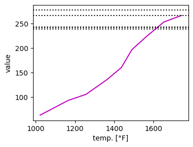
To resolve the discrepancy in color distribution, let's try looking at the overall brightness by taking the root sum squared for the above:

For 3 out of the 5 samples, we get a crossing at around 1600°F. I couldn't find a definitive source for maximum stovetop temperatures, but I found a Reddit post that suggests the range 1470°F to 1652°F, agreeing nicely with my measurements!

The neat thing about black-body radiation is how universal it is: When a welder heats metal to the same brightness as the Sun, it's because they're the same temperature, and the whole universe is still glowing from the heat of the Big Bang!

Sunday, August 25, 2024

The How of the Wow

In 1977, the Big Ear radio telescope at Ohio State University [alma mater-mandated "Boo!"] picked up a burst of energy that was dubbed the "Wow! signal" thanks to researcher Jerry Ehman's note on the printout:

Big Ear

There's been a lot of speculation on possible sources – It was an exceptionally strong signal in a narrow bandwidth. On top of that, the frequency of the signal is associated with hydrogen's emission line, which had been identified by the first SETI paper in 1959 as a likely choice for extraterrestrial species to send messages. If you look closely at the image above, the circled bit reads "6EQUJ5". As this story got around, some people misunderstood this as a message in the signal, but it's actually the measurement of the signal-to-noise ratio in time: Each character is the SNR for a 10-second span, with letters A-Z representing SNRs of 10-35 – Quite high values!

A lot of the mystery surrounding this signal has been its transient nature. Followup searches found no recurrence of the signal, which ruled out a pulsar as the source, but also calls the ET explanation into doubt – Wouldn't a message like that be repeated? However, one of the arguments for the signal being artificial is its narrow bandwidth. Coincidentally, I've been listening to old episodes of the Futility Closet Podcast, and I came across an episode from almost 10 years ago about this signal. They liken the Big Ear telescope to a row of radios in a line, each tuned to a slightly different station – These correspond to the different columns in the printout above. One of the surprising things about the Wow! is that it only appears in one column. Most astrophysical signals would have more variation.

The signal is back in the news thanks to a new paper identifying its source. The authors were using the Arecibo Telescope (RIP) to search for similar signals to the Wow!, and were able to find several with the same spectral qualities, though never with the high intensity of the original signal. The hypothesis they arrived at was that an object like a magnetar or a soft gamma repeater released a burst of photons, which passed through a cloud of hydrogen, causing stimulated emission (the se in "laser") of photons at the detected frequency:

Figure 4

It might seem disappointing to have the possibility of a signal from aliens ruled out, but it's also an opportunity to understand the universe better, which in turn gives us better chances of finding a real signal in the future. Alternatively, we could end up making our own version of the Wow! for another species out there.

Sunday, August 18, 2024

Stirring Coffee with My Thumb

Recently I was listening to the song The Frozen Logger, which my father Steve often sang when I was growing up. When I got to the line "at a million degrees below zero" though, the physicist part of my brain butted in to point out that the lowest the temperature can get is absolute zero, or -459.67 °F. Could he have been talking about wind chill? We can rearrange the equation for wind chill to give the velocity required to get from a given true temperature to -1 million °F:

Even at absolute zero, the wind speed would need to be 100 trillion times light speed, which is just not how anything works. A temperature this low is far outside the realm of possibility, but I'm not one to make a fuss over poetic license.

As I was thinking about this though, I started wondering about the other direction: Is there a maximum temperature allowed by physics? One way to think about temperature is the average speed of the molecules in a substance. Using the Maxwell distribution, we can find the temperature associated with an average speed:

Plugging in c for the velocity and the mass of hydrogen, we get a maximum temperature of 7.7 x 10^12 °F. Like the above, this has it's own set of problems: The v in the equation above is the average speed, but the particles all need to stay in (roughly) one place. That means rapidly changing direction, which would require enormous forces. In any case the speed distribution above was derived without considering relativity, so we can't actually apply it to speeds this fast.

I decided to see what possibilities the larger physics community had come up with for maximum temperatures, and I found this article polling some experts. Most of those arguments go back to the early universe, since the Big Bang model of the universe posits that all energy started at a point and has been expanding and cooling since. That concept leads to Planck units, which are combinations of the constants that go into the four fundamental forces in our universe. In the earliest stages of the universe, these forces are believed to have been unified into a single force, but we don't have a model for that yet (the elusive "Unified Field Theory"). The Planck units represent the scale for different quantities at which our understanding begins to break down. For temperature, this is 1.4 x 10^32 K – Converting this to °F doesn't make much difference, since it's still 20 orders of magnitude larger than our previous estimate.

One thing I find really interesting about physics is how well a model can work in one regime, but the same model gives bonkers predictions on a different scale. It's strange to have islands of complete understanding surrounded by seas of uncertainty.

Sunday, August 4, 2024

Scents and Scents-Ability

[Yes, it's a homophonous headline!]

We adopted Eros from the Humane Society, which had picked him up as a stray, so we know nothing about his breed and history. He reminds Marika of the beagle she grew up with though, and he has many hound-like traits, including an intense interest in smells. Often during walks he'll plant his feet for several minutes, and swing his head back and forth sniffing.

I was curious what kind of directionality he could get just by moving his head – I imagined that after a good distance, the scents would be too blended to pick out individual sources.

Smells are created by bits of a substance that are picked up by the air. Those bits then spread out according to Fick's Laws of Diffusion. The form of this equation, where the change in time depends on the Laplacian of the current state, is exactly the same as that of the heat equation, which I've discussed before. What's interesting about this case though is that heat has only one type spreading out, while we can have different smells that diffuse and mix.

I decided to adapt my cake-heating simulation to look at how much directional information Eros can get from his head movements. The setup is two sources of scents that emit particles according to Fick's laws. Eros then senses the concentration of each in a cone in front of his nose. I struggled to find a good way to display the concentrations, which drop off rapidly from the sources, but I suppose that's just a testament to the sensitivity of dogs' noses. The first case has the two sources equidistant:

Like I said, you can't see much past the central dots, but if we add up everything in the white cone,

Now we do get directionality. I was curious to see what happens when we put one source closer:

For this case the concentrations are

Because the blue scent is closer, it has a higher concentration in all directions, but comparing the left and right ends of each curve, we see we can still find a direction that gives more scent.

Sunday, July 28, 2024

Hyd-Rant

A couple weeks ago, my father-in-law Scott told us about an incident he heard about in a nearby water system (part of his field of expertise): A local fire department was testing their equipment with water from a fire hydrant, and shut off the valve too quickly. The high volume of water that had been flowing through the pipes slammed into the closed valve, and the resulting pressure wave bounced back and caused issues at other points along the water line. Scott mentioned a couple ways to avoid this: A Kunkle valve is designed to release excess pressure to avoid damaging other points along the line, or the firefighters could simply close the hydrant more slowly.

I was curious if I could adapt the same Lattice Boltzmann simulation I used a couple months ago to show the effect Scott was talking about. I had hoped to try including multiple outlets for the water to represent other customers, but it took me several tries to get the simplest case working: Water flows through a single pipe that closes at one end. In the simulation, when fluid hits a boundary, it bounces off, reversing its direction. This is a change in momentum, which is exactly what a force causes. We can use this change in momentum to find the reaction force (equal and opposite, per Newton) that the water is putting on the pipe.

One issue I encountered with the simulation was the spatial resolution: if we make things too coarse, then closing the valve involves big bricks of wall being added at once, which leads to sharp spikes in force. Increasing the number of pixels helps smooth it out, but then it takes longer to run. I didn't get around to trying to add other pipes to the main line, but I'm still quite pleased with the results.

The animations below shows the horizontal velocity of the water at different points along the pipe: red shades are to the right and blue to the left. The valve begins to close at t=100. For the slowest case, I used 600 steps to close it fully:

The fastest case I tried snaps shut in only 50 steps:

Comparing the two, you can definitely see more, and darker, blue in the fast case, indicating significant ricochet from the valve. to get more quantitative though, we can use the force calculation I outlined to find out how badly we're shaking up the system:

The maximum force is clearly proportional to the time it takes to close, but there's also some interesting oscillation from the right/left flows running into each other. You can also see a bit of the resolution effect I mentioned in the spikes along the curve.

When Scott described this, it actually reminded me of something I experienced growing up: At my parents' house, if you shut off the shower too quickly, there would be a sharp "bang!" when the flowing water hit the valve. This is sometimes called a water hammer, and can damage the pipes in your house, just like this hydrant can affect a whole system!

Sunday, June 30, 2024

Angle of the Dangle

Since last year, Steve has been confined to a wheelchair. He gets in and out of it with help from a device called a Hoyer Lift:

Hillrom

The straps at the head and legs have several different notches to adjust the length from the hoist attachments. Along with those adjustments, Steve can also lie higher or lower in the sling, and adjust the angle between his legs and torso. Given these options then, Sally asks: How do we adjust things to get Steve to be more/less upright?

This turns out to be a surprisingly complicated geometry problem. I started off by diagramming it this way:

a and b are the lengths of the two straps, L is Steve's height, h is how far down the pad he's positioned, and θ is the leg-torso angle. We can use the Law of Cosines to first find the width of the two triangles, w, and then the angle between the lift straps:

What we need to figure out from here is the coordinates of that lowest point, where the sling bends. To do that, I rotated the setup so that a lay on the x-axis, and worked out the geometry from there. If the point we want is at (x,y) in these coordinates, then we can write

Solving these 4 equations together produces pages of messy equations, so instead I decided to do it numerically. Since my goal was to make an interactive tool my parents could use, I'm working in JavaScript, so I had to make my own equation solver. I decided to use the bisection method, in which we find the point where a function crosses zero by bracketing it more and more finely. For some combinations of parameters the algorithm fails to find a solution, and the angles don't always look right, but I think it can give a feel for how these different choices factor into the final angle that the lift rests. You can see the code here, or just play with it below!

Saturday, June 22, 2024

Ozoning Regulations

Recently our local news in Michigan issued an air quality alert, which mentioned an increase in ozone levels. I was curious about this, since I know the ozone layer protects us from harmful UV light, and the hole over the South Pole is a major environmental concern. That hole was caused by certain pollutants, so I was surprised to hear increased ozone also being associated with poor air quality.

The key is where the ozone is in the layers of the atmosphere. The ozone layer that protects us is in the Stratosphere, while the one associated with poor air quality is in the Troposphere:

Wikipedia

The majority lies above 15-20 km and absorbs 97-99% of the UV light that comes from the Sun. The ground-level ozone results from byproducts of burning fossil fuels. Since ozone is made of 3 oxygen atoms, rather than the 2 that make up oxygen's breathable form, it's heavier, and so I wondered about the process that keeps it at those high altitudes. It turns out it's a continuous cycle, in which oxygen atoms bond and unbond in different configurations. The process is mediated by UV light, which is absorbed by ozone to break it into gaseous oxygen. Since it's absorbed up there, it doesn't make it to the troposphere to break up the ozone down here (or damage our DNA, so overall plus).

The benefits of ozone in the upper atmosphere, combined with its dangers in the lower atmosphere made me wonder if there were a way to transport it upward. Other people have wondered that, and unfortunately it doesn't work. Since ozone is heavier than oxygen, it won't naturally rise, and we'd need to carry it upward. That has its own problems though, since ozone corrodes many materials, so it would get expensive to keep making new containers. The other problem is that there just isn't a lot of ozone down here compared to what the upper atmosphere holds. It would be difficult to collect enough to make the process worthwhile. It seems our best bet is to stop making ground-level ozone in the first place, and to keep the upper-level ozone doing its job!

Saturday, June 15, 2024

Everything But the Magnetic Sink

I was looking at some of the environmental data supplied by our PUC this week, and I had a thought on the magnetometer reading:

A magnetometer measures the direction and strength of the local magnetic field, similar to a compass. A significant difference though is that a compass only measures the horizontal direction of the field, while this reading shows all 3 dimensions. What's interesting about that is that we can see the field here has a significant z (vertical) component.

The Earth's magnetic field is approximately a dipole, with an offset of 11° from the rotational axis. We can plot the field lines over the surface:

The red line shows the rotational axis, and the magenta line shows the axis of the magnetic field. Notice that the lines come out of the South pole (a source), and go into the North pole (a sink). One of the strange quirks of how we define our magnetic poles is that because the North pole of a compass points toward the North geographic pole, this must be the South pole of the Earth's magnetic field. Using this plot, we can plot the relationship between the vertical angle of the magnetic field relative to the surface and your latitude on Earth:

The two curves represent the two halves of the Earth in the plot above: the right side, closer to the North pole, and the left side opposite it. The PUC gives us the horizontal dotted line, and we can look up our latitude here in Michigan for the vertical line (or "look up" to the North Star if you want to be fancy). In theory, we could measure our longitude by interpolating between the blue and green lines to the point where the red lines cross. Trying that out gives a position of -37.84°, while our true longitude is -83.86°. Maybe I'll stick to using GPS for now!

Sunday, June 9, 2024

An Anod(yn)e Dock

This week my in-laws, Scott and Athena, bought a new dock for their lake. They decided on one made from anodized aluminum, and we were talking about its advantages over other materials. They told me that it doesn't heat up as much as other materials, and this made sense to me from baking with aluminum pans: They tend to heat up quickly and evenly, but there's also very little risk of burning yourself on them. I thought this was due to the heat capacity, the relationship between heat and temperature. Colloquially, we tend to equate these, but there's an important difference: Heat measures the internal energy of a substance, while temperature tells how easily it will give up that energy. Heat flows from high temperature to low temperature. Heat capacity measures how quickly temperature changes as heat flows in or out – Water has a relatively high heat capacity, which is why even a small amount of hot water can burn you. Previously, I had thought aluminum's low heat capacity meant that if you touched a high-temperature pan, your finger would cool it much faster than it would heat your finger. It turns out there's a bit more to it than that.

Scott and Athena mentioned that it was important their dock was made from anodized aluminum, rather than natural aluminum. Anodizing is a process that adds a layer of oxide to the surface of a metal, protecting it from corrosion. In the dock's case though, they said that this also made it feel much cooler than the natural aluminum, which would get uncomfortably hot in the sun. This didn't work with my explanation, since anodizing is a surface effect, which wouldn't significantly change the heat capacity of the bulk material. I decided to compare both the heat capacity and the thermal conductivity, which measures how quickly heat flows through substances:

MaterialHeat Cap. [J/kg K]Thermal Cond. [W/m K]
Stainless Steel50214.4
Natural Aluminum921236
Anodized Aluminum9211.07

Contrary to my previous understanding, aluminum actually has a higher heat capacity than steel! In reality the key difference is in the thermal conductivity, for which the three metals have vastly different values.

Sunday, June 2, 2024

Kibble Quibble

We recently got a new bag of food for our dog Eros, and we try to taper him off the old food, since he has a sensitive stomach. As I was serving it up this morning, I got to thinking about how the mixture of foods changes depending on how long we spread the transition. If every day we feed him a total amount d, and we spread T days of old food across b days, we can write

where r is the rate we swap the foods. This is the series for the triangle numbers, so we can replace the sum and solve for the rate:

Using this, we can look at how the rate changes depending on the total amount, and the number of days we spread across:

Note that we require b > T, since otherwise we'd be giving more than a day's food in a day. Since b and T are both measured in days, I wondered if the ratio, representing how much we spread out the old food, had a clear relation to the rate of change in the mixture.

I expected that the points would all fall on a single curve, but there seems to be some variation depending on the specific values for b and T. 

Whenever I hear Eros's stomach making terrible noises, I'm reminded of a bit from Terry Pratchett's Guards! Guards! – "No wonder dragons were always ill. They relied on permanent stomach trouble for supplies of fuel. Most of their brain power was taken up with controlling the complexities of their digestion, which could distill flame-producing fuels from the most unlikely ingredients. They could even rearrange their internal plumbing overnight to deal with difficult processes. They lived on a chemical knife-edge the whole time. One misplaced hiccup and they were geography."

Sunday, May 12, 2024

Whistle While You Wheel

Shortly after Marika and I got our car, we installed a roof rack to carry our cargo box for camping trips. The first time we drove on the highway with it, we suddenly heard a clear, crisp note from above our heads. As our speed changed, the note would suddenly shift to a new pitch, just as clear. The roof rack has a channel running down the center of its length, with a rubber seal on top that opens on each end. I realized it was acting exactly like a flute – Air blown across one end of an open tube was resonating at a specific frequency. I had hoped to make a simulation of this at the time, but I couldn't get my head around the equations involved.

Some time later, I found this wonderful interactive simulator, and tried adapting that to this situation, but now the obstacle was introducing the pipe geometry. Finally this week I looked again, and was saved by Daniel Schroeder, who introduced me to the HTML5 simulations I've shown here. Schroeder's demo shows how a steady stream past a barrier can create vortices, but we want a tube with an opening on top. Here's the boundary I came up with:

Now we can see what happens to air moving left to right. The simulation used here keeps track of the density and velocity of air at each point. To get the next state, it uses the Lattice Boltzmann method, which involves two steps: collision and streaming. The collision step changes the velocity in each cell to push the system toward equilibrium, and the streaming step uses those velocities to shift the density between cells. You can find my adaptation of Schroeder's code here. I found that this setup would pretty quickly reach equilibrium, but to get sound we need oscillation. Adding a little bit of noise allowed it to settle into an oscillating pattern. Looking at the full map we can only really see the transients (though those are pretty nifty):

If we instead focus in on the opening of the tube, we can see the density oscillating around a central value, which is exactly what we need to get sound:

Now on to the pitch question: We can measure the relative strengths of the frequencies using an amplitude spectral density, and see how it changes for different speeds.

Sharp peaks indicate a clear note, and we can see a few here, separated by the different speeds. This is exactly what we experience in the car, and it's pretty cool to see it show up in such a pared down model – One of the things I love about physics!

Sunday, May 5, 2024

Making a Spectacle

This week I noticed something interesting about my shadow: I could see the lenses of my glasses casting a dark spot with the rest of my head. This made me curious, since I can see through my glasses, meaning light is passing through them, so why would they cast a shadow? Taking them off revealed an even more interesting effect:

There's a dark spot in the center, but a magnified brighter area around it. I decided to try some ray-tracing, a technique in optics where we consider beams of light coming from a source and follow their path through a system. Often this is done using matrix optics, in which lenses and other elements are represented by matrices which are multiplied together to create a system. Rather than deal with that directly though, we can use Python's RayTracing package to handle the math for us.

Lenses are typically defined by their focal length, which specifies the distance from the lens where parallel beams passing through it converge. However, glasses prescriptions are given in diopters, which are the inverse of the focal length. I'm nearsighted, which requires a lens around -5 diopters. The negative means that the convergence point is on the same side of the lens as the source. This is a little clearer with a diagram: Since the Sun is far away, its light is roughly parallel, so we can look at what my lenses do to a bunch of parallel beams (click to enlarge):

This shows the light being spread out by the lens – If you follow those lines to the left, they converge on the opposite side of the lens, corresponding to the negative focal length.

That accounts for the magnified bright spot we saw above, but it's only considering the light that goes into the lens – There's also light that goes past the lens on the sides. We can add together this light with what was redirected by the lens to get the total image:

The different lines show distances from the lens to the surface of the shadow. As in the picture that started this, we see a dark spot surrounded by a brighter area! What's interesting is that, because the beams from the Sun are parallel, the shadow (drop in intensity) stays the same size for all the distances, but the brighter area gets bigger or smaller. I've been wearing glasses since the 4th grade, but somehow this is the first I've wondered about their shadow – One of those blind spots that seems obvious once you see it.

Sunday, April 21, 2024

It's a Wash

[This post contains flashing images after the break. Photosensitive folks may want to skip it.]

I recently got this question from my Aunt Linda: I hate my washing machine because it is always off balance and knocks the shit out of itself. So I stare through the clear lid and try and figure out which piece of clothes is causing the problem. It really is trial and error. So I was thinking that the design should include 4 quadrant color distribution and help. Then I thought how fast the rotation is and where to spread out the different colors so they create the illusion of coming together visually by the timing of when the color is matching. Would there be a formula that would work at giving rotation and circumference?

Similar to a previous post on flickering lights, this question brings us into the field of psychophysics. I liked Linda's idea of using a color scale, so I decided to try animating an HSV color wheel with a wobble:

As Linda says, it's difficult to line up the color with the motion. My idea was to try to cut out the extra info by focusing on only a central slit. We can add some scale lines as well to help:

Now we can see pretty clearly that the red points are the heavy ones, pulling the washer out of alignment. Problem solved, right?

Sadly not. The images above are animated GIFs, which have a maximum frame rate of 100 frames per second. Washers on the other hand, tend to spin at over 1000 RPM. For the points I show, that would require 833 frames per second. We can get around the limit by exporting the animation as a giant block of HTML, but the result is pretty dizzying, so I'm going to paste it after the break. Thanks for a great question, Linda, though I wish I could have given you a more satisfying answer.