A while ago, Marika started making homemade vegetable broth from scraps. The recipe makes a large batch at a time, so we freeze it in cubes to use as needed. Last week, I was defrosting some in the microwave, and I started wondering about the ideal power settings to use. Microwaves are designed to heat the water molecules in food – The molecules are electrically polarized, and the oscillating electric field from the microwave makes them rotate back and forth, which translates into heat. In ice, though, the molecules are locked in a crystal formation, and unable to absorb energy as efficiently. If we run the microwave at full power, a lot of that energy will be wasted until the ice begins to melt. That's why the defrost settings opt for lower power and longer time. Once we get some liquid water though, we could increase the power and let the water conduct heat into the ice it surrounds.
I was able to find a paper on simulations of water and ice in a microwave, which included some nice plots of the energy absorbed over time. I used an online tool to extract the data, then did some linear fits to estimate a power level for each:

You may notice I've left out units on this plot – Usually a major faux pas in physics, but (possibly due to suffering from a cold) I found I had to fudge things a bit to get my simulation to work, so bear with me.
With this information in hand, we can imagine starting with a block of ice at a given temperature, and applying a given amount of power, which is scaled according to the factor found above. Once the ice begins to melt, the water can absorb energy more efficiently, and then transfer that energy to the ice through conduction. Recall that to change phases, materials need to absorb some extra energy, called the latent heat. Therefore, the key points of the simulation are
- The ice must be heated up to melting point
- Once at the melting point, additional energy transforms ice to water
- Water heats up as it absorbs energy
- Ice can absorb energy from the water according to the volume of water and difference in temperature
We stop the simulation once all the ice has melted. I tried out a series of different power/time settings for melting the ice most efficiently. They're plotted below, with the y-axis showing the fractional power delivered at each time. The length of the line shows how long it took all the ice to melt, and the color shows the total energy used (the area under the curve).
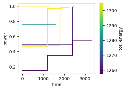
To defrost as quickly as possible, it's best to just blast full power, but this wastes a bunch of energy. To see why, we can look in detail at the max and min total energy cases:


These show that the vast majority of the time is spent just getting the ice up to 0°C. Once that happens, the water begins absorbing energy and speeds up the melting considerably. One caveat with this though is that the energy differences in the above are not huge – This makes sense, since the fraction of power absorbed by the ice and the energy needed to heat it to melting are constant. In my sickened state I didn't have the energy to test out heating routines as much as I'd like. I encourage you to try your own optimization of broth heating.


